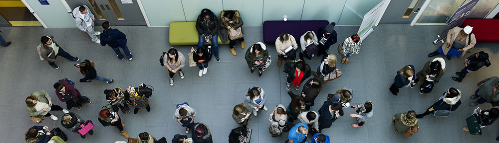
It’s been a febrile week so far, and it’s only Tuesday.
In response to worldwide and national Black Lives Matter demonstrations, universities, like many other major corporations, have taken to social media to make statements to express their solidarity, as discussed in this article “We can’t separate the issues of race and reopening in universities” by Tahmina Choudhery on Wonkhe who says:
“Some were strong, some impossibly generic. Some were from real people and leaders, others read more like corporate marketing material. But whatever form they took, one they were met with the same response – why do you suddenly care now?“
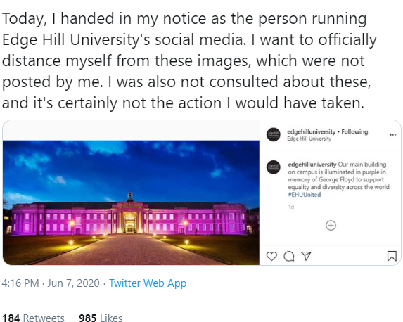
Winning a prize for being tone deaf is possibly Edge Hill who repurposed a photo previously used for Epilepsy Awareness, resulting in the person running their social media channels publicly resigning over not being consulted…
Today also saw the publication of the first of this year’s crop of league tables – again more on this can be read over on Wonkhe where Paul Greatrix has cast his eye over the results (spoiler alert, there are no surprises). The surprise changes in league tables will only come after taking into account the effects of the Covid-19 crisis on students’ satisfaction, attainment, employment and indeed recruitment, but that won’t feed through in the data for another two or three years.
So why don’t we try to combine these two threads…
For years, universities have now that they have a problem with an attainment gap between White and BAME students. And for years the research has been available that shows that even correcting for entry grades and other factors that these gaps still exist.
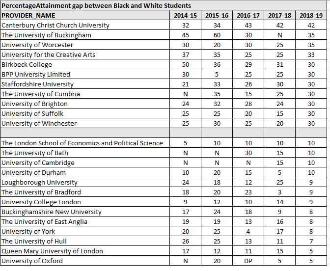
Data produced by Office for Students in their Access and Participation dashboard can be used to see the attainment gaps in the sector and across different institutions. Downloading the data allows us to create a league table that shows, amongst other things, the attainment gaps in each university. A word of caution – for universities with small populations of Black, Asian or Minority Ethnic students, then because the data is rounded to the nearest 5, then the results may not be significant. However, by looking at the data on the online dashboard, results which are statistically significant are highlighted.
This is what happens if we take the data, and filter it for:
- mode of study = full time or apprenticeships
- level of study = all undergraduates
If we then rank in terms of attainment gap between Black and White students in 2018-19, here’s the two ends of the table:
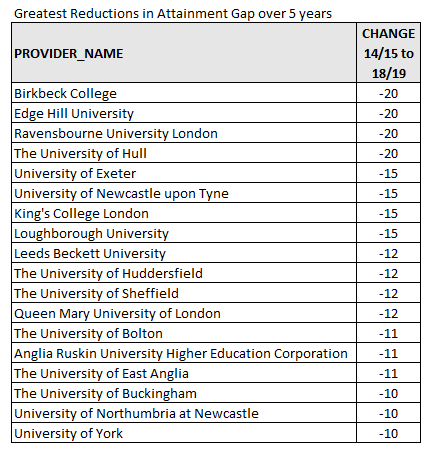
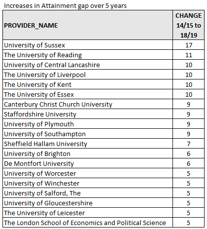
And if we put the universities in order of change in attainment gap in the last 5 years (which might show who has been successfully working to tackle this):
And those with increases in attainment gaps in the last 5 years:
This may not be a perfect way to look at what is known to be a hugely complicated, multi-variable problem. But having some numbers easily available certainly shows the differences between universities.
A final thought – this has been written in terms of attainment gap, as it is often described in the literature and indeed in the data files. Other authors have suggested that this is the wrong terminology – it assumes a deficit in the student, and what we should really be reporting is an “awarding gap”.